 Decomposition Reports
 See also: Summaries View, Cost-Benefit Summary Reports, Marginal Abatement Cost Curve (MACC) Reports
Introduction
LEAP can help you analyze the factors underlying the trends in your scenarios using decomposition reports, which draw upon the methodologies known as IPAT and the Kaya identity.
-
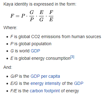
I = P × A × T: The IPAT expression equates human impact on the environment (I) to the product of three factors: population (P), affluence (A) and technology (T). It is similar in form to the Kaya identity which applies specifically to emissions of the greenhouse gas carbon dioxide. The equation was developed in the 1970s by Barry Commoner, Paul R. Ehrlich and John Holdren. More on the IPAT equation here.
-
The Kaya identity developed by Yoichi Kaya, is an identity stating that the total emission level of the greenhouse gas carbon dioxide can be expressed as the product of four factors: human population, GDP per capita, energy intensity (per unit of GDP), and carbon intensity (emissions per unit of energy consumed). It is a concrete form of the more general IPAT equation (shown right, source: Wikipedia). More on the Kaya identity here.
Displaying Decomposition Reports
Decomposition reports are a special type of report displayed in the Summaries view. To create a decomposition report, first click on the Manage Summaries screen, and add a new named Decomposition report.

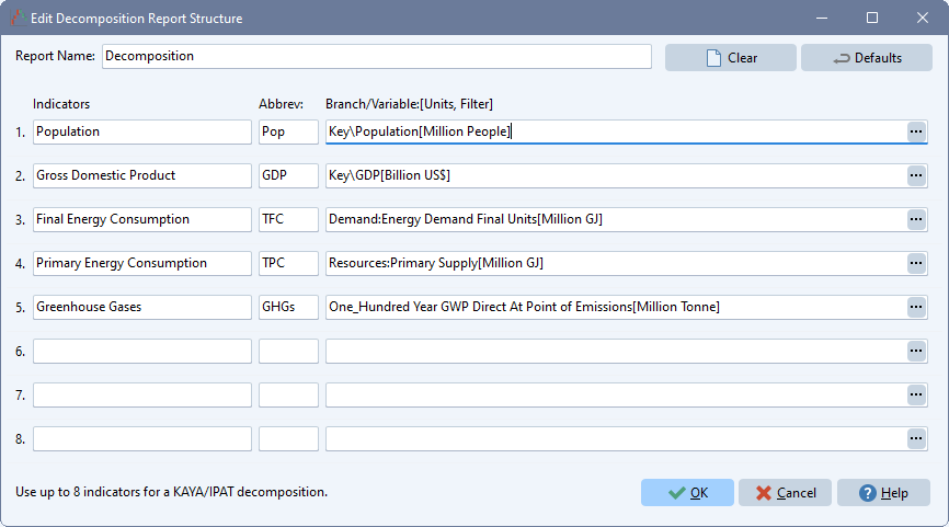
LEAP's decomposition reports are highly configurable via the Edit ( ) screen shown here. From this screen you can specify the branches and variables that will be used as the basis for the factors that make up the IPAT/Kaya decomposition. The example shown here is similar to a Kaya decomposition, with the exception that here we further decompose energy consumption into final vs. primary energy use. Note that many additional types of decompositions can be created. For example, you might choose to decompose the factors leading to air pollutant emissions (e.g. PM2.5 or SO2). If using the IBC module in LEAP you might try decomposing the factors affecting premature mortality related to health impacts.
Use this screen to specify names and abbreviations for each indicator to be included in the decomposition report. The indicators should be specified in the order they are used in the decomposition, with the last indicator being the ultimate impact indicator. Use the Branch/Variable selection wizard to specify the branch, variable, units, scaling factor and any special results filters for each indicator.
You can create multiple decomposition reports, each with different names and different settings. Use the Add button ( ) in the Manage Summaries screen to create additional MACC reports.
Displaying Decomposition Reports
Once a decomposition report has been set up, return to the Summaries screen and select it. Reports can be displayed ether in table or chart format. Each decomposition reports summarizes the factors affecting the changes in the ultimate indicator variable (e.g. GHG emissions). The report can summarize the changes from one year (the base year) to another (the end year) in a given scenario, or from one scenario (e.g. a baseline scenario) to another (e.g. a mitigation scenario) in any particular year. Use the tool bar above the summary report to select whether the report will compare scenarios or years.
Two types of charts are available for summarizing decomposition charts: a waterfall chart or a time-series bar chart.
Waterfall Charts
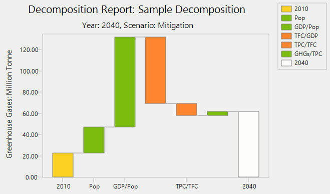
The waterfall chart summarizes the changes in factors as a set of steps. The first bar in a waterfall chart shows the starting value of the ultimate indicator, and the last bar shows the final value of that indicator (in the target scenario or year). The intermediate bars show whether each factor contributed to an increase or a decrease in the indicator. Increases are shown in one color and decreases in another.
For example, in a decomposition showing factors causing GHGs to rise from 2010 to 2050 in a baseline scenario:
- the first bar will show 2010 GHG emissions in the scenario;
- the second bar will show the scale of increase or decrease in population;
- the next bar will show the scale of increase or decrease in GDP per capita (affluence);
- the next bars will show the scale of increase or decrease in energy use per unit of GDP (in the above example this is broken down into two bars, one for final energy use per unit of GDP and one for primary energy use per unit of final energy use);
- the penultimate bar will show the scale of increase or decrease in GHGs per unit of primary energy use;
- the final bar will show 2050 GHG emissions in the scenario.
An example of this type of chart is shown below for the period 2010-2040 for a mitigation scenario. Note how some factors cause the ultimate indicator to increase (e.g. population, affluence), while others (energy use per unit of GDP - a proxy for energy efficiency) cause a decrease.

Time-Series Bar Charts
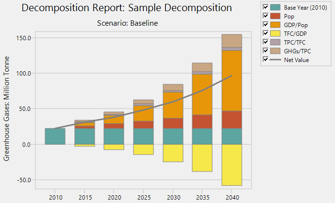
You can also show decomposition results on a time-series bar chart as shown below. This type of shows the contribution of each factor to the ultimate indicator in a series of bars: one bar for each year.

The underlying data used in this waterfall chart can also be displayed in table format. In this format LEAP shows a summary of the values for each indicator as well as a summary of the calculated factors (e.g. Population, GDP/Pop, Energy/GDP, GHGs/Energy) and benchmarks values for each factor relative to the starting conditions. Finally, the table also displays the contribution of each calculator factor to the overall change in the ultimate indicator.
Various on-screen options, displayed in a tool bar on the right of the screen, can be used to customize the display of the MACC chart. You can increase ( ) or decrease (
 ) the number of decimals displayed in the table, change the display of grid lines on the chart (
 ), change the table font (
 ), add labels to the chart (
 ) export tables to Excel (
 ), print and preview tables and charts (
 ), copy charts and tables to the Windows clipboard (
 ), and export charts to PowerPoint (
 ).
).